
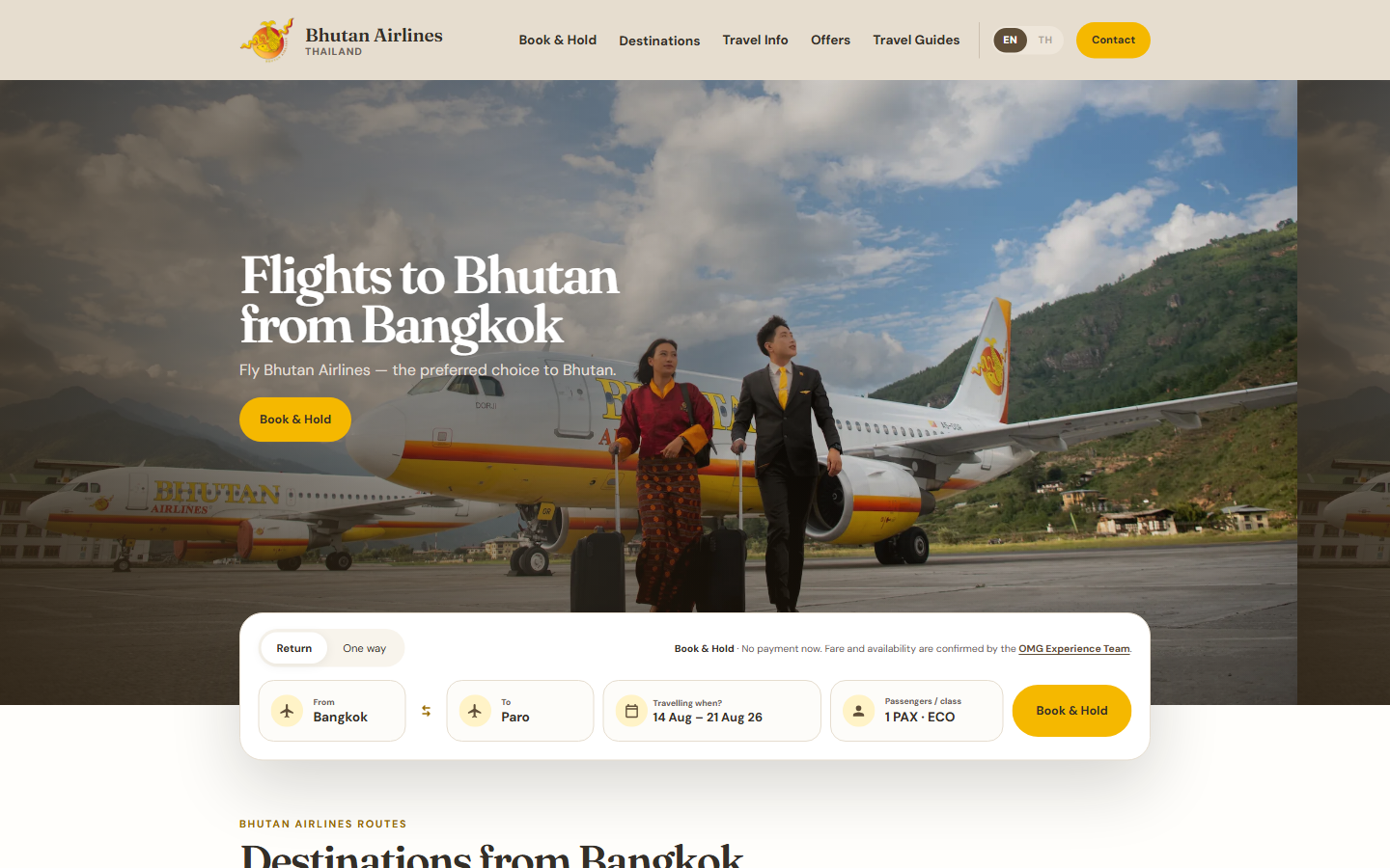
This is not a travel story. If you landed here looking for Paro, Tiger's Nest or when to fly to Bhutan, the rest of the site is that way. This is the story of how the site itself got made — because the whole thing, every page you can click, was designed and built in-house by a small team directing an AI, and I think the "how" is worth writing down.
I'm writing as the person who ran the project for OMG Experience, the appointed General Sales Agent (GSA) for Bhutan Airlines in Thailand. I am not a front-end engineer. I didn't hire an agency. What I had was a clear idea of what an airline's booking experience should feel like, a strong opinion about details, and a modern AI coding tool. People now call this "vibe coding": you don't hand-write the code, you describe the intent, review what comes back, and keep making the calls until it's right. That's exactly what this was — with a lot of reviewing.
Start with the system, not the page
The temptation with any website is to start hammering out the homepage. We did the opposite. Before a single real page existed, we built a design system — a "UI kit" that defines the colours, the type, the spacing and every reusable component in one place.
That meant naming our palette (Dragon Gold, OMG Taupe, Rice Paper, Warm Mist), locking a display typeface for headlines and a clean sans for body text, and defining tokens for spacing and corners so nothing would be improvised later. The point of tokens is boring on purpose: when the same value drives every button, card and section, the whole site looks like it came from one hand. Ours did.
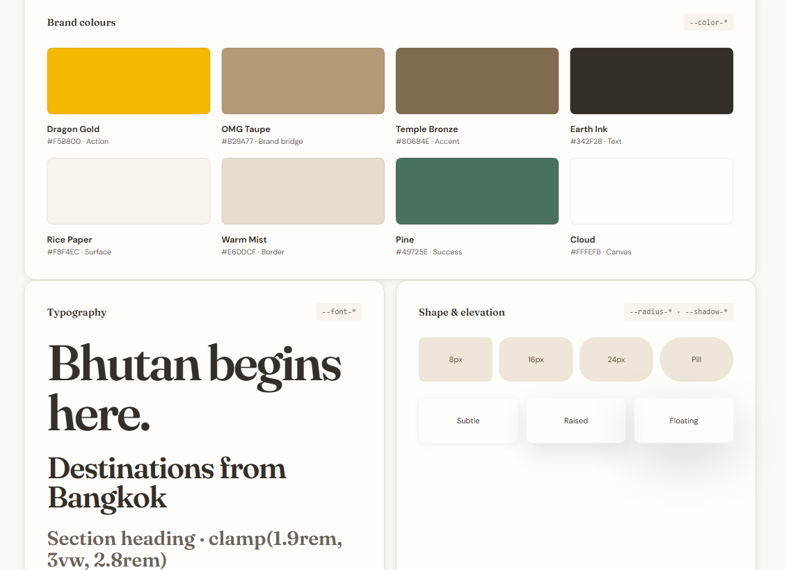
Once the landing page was finalized against that system, it became the reference. Every page built afterwards had to inherit the same margins, the same section rhythm, the same card style. Whenever a new page drifted, the instruction was simple: "look at the home page and match it." Finalize the standard once, then make everything obey it.
Building it, one page at a time
From there it was page by page: the booking widget, destinations for Paro, Gaya and Kolkata, travel information, offers, tour packages, contact — and the page that matters most to us commercially, Book & Hold.
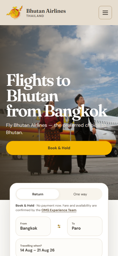
Book & Hold is genuinely different from a normal airline checkout, and that difference drove a lot of the design. We don't take card payments online. As the GSA, our reservation team confirms seats and the final fare with you first, and payment happens later by bank transfer. So the "booking engine" had to look and feel like a real one — route, dates, passengers, cabin — but end in a request, not a payment. Getting that to feel trustworthy rather than suspicious took many rounds: clear "no payment now" messaging, the OMG and Bhutan Airlines logos shown together to establish we're the official channel, and short, honest steps.
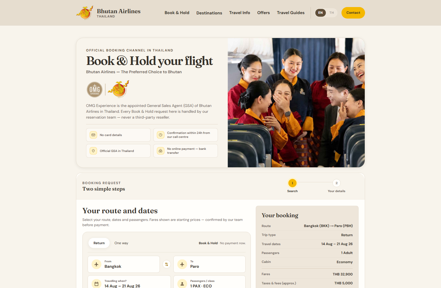
To make good decisions we studied the best in the business. Using a web-research tool wired into the editor, we pulled apart how Emirates, Etihad, Qatar Airways and Singapore Airlines handle the fiddly bits — the slim booking panel, the single combined date picker, the tabbed travel-information pages, the way a good FAQ accordion behaves on hover. We didn't copy them; we borrowed the patterns that have already been proven on millions of travellers and adapted them to our brand.
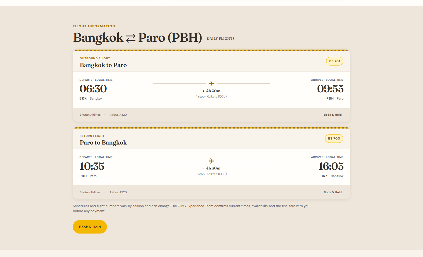
One example I'm still fond of: the flight schedule on each destination page is styled like a boarding pass, right down to the perforated edge. It's a small thing, but it turns a boring timetable into something that feels like the airline.
The real rhythm of the work was less glamorous than "AI builds a website" makes it sound. It was a loop: describe the change, let the agent implement it, take a screenshot, and critique — this card isn't aligned to its icon, that gap before the FAQ is bigger than the others, this button feels "too AI" with an arrow on it, these two sections next to each other are the same colour and shouldn't be. Then round again. The AI is fast and tireless, but taste, alignment and restraint were decisions I had to keep making.
Cursor as a creative partner
The tool at the centre of all this was Cursor, an AI-native code editor. What made it good enough to build a real product wasn't autocomplete — it was Agent Mode: you give it a task and it reads the codebase, edits files, runs commands, checks the result and iterates until it's done or hits a guardrail. It behaves less like a chatbot and more like a fast junior engineer you can direct.
Two features did the heavy lifting. First, a plan mode that forces the agent to research and propose an approach before touching anything — so I could catch a bad idea on paper instead of in the code. Second, the Model Context Protocol (MCP), an open standard that lets the editor reach into real tools: the web-research crawler I mentioned, a browser it can drive to open pages and take its own screenshots, image sourcing, even our cloud account. The agent could look at competitor sites, look at our own rendered page, and act on both in the same loop.
I'll be honest about the limits, because the hype skips this part. The AI never decided what the brand should feel like, what a customer actually needs, or when something was "good enough." It got alignment wrong, over-designed sections, and produced bugs — especially the first time real iPhones met our layouts. It's a phenomenal multiplier on execution and a poor substitute for judgment. The value was in the pairing: my direction, its speed.
Making it real on AWS
A beautiful set of HTML files is not a website until it's live, fast and reliable. Two choices shaped that.
The first was Astro as the framework. For a content site like ours — lots of pages, not much app-like interactivity — Astro ships mostly plain HTML with very little JavaScript. That keeps pages fast and light, which is exactly what you want for travellers on phones and patchy mobile networks. So we ported the hand-built design system into an Astro project that generates every page from our components.
The second was AWS for hosting. Most of our audience is in Thailand, searching on a phone, and we needed the site to feel instant and never go down. AWS serves the site through its global content-delivery network, which by mid-2026 runs from 750+ points of presence across 100+ cities in 50+ countries — so a page is delivered from a location near the visitor rather than from one distant server. Because it's a static site behind that network, there's effectively no application server to crash under load; the storage layer alone is designed for eleven-nines of durability, and traffic is absorbed by the edge. In practice: fast for Thailand, resilient during spikes, and cheap to run.
The stack behind the scenes grew as we needed it, never before:
- Amplify + CloudFront host and distribute the built site, with HTTPS and a proper build-and-deploy pipeline.
- DynamoDB stores the things we actually need to change — fares and blog content — so the site can be rebuilt with fresh data.
- Lambda receives Book & Hold, package and contact enquiries; SES sends the confirmation emails (to the customer, and to our team).
- Cognito secures a login for our own admin panel — a small in-house CMS and mini-CRM where we edit fares, publish articles, and see every enquiry that comes in.
- A build pipeline (CodeBuild) bakes the latest fares and posts into the static site whenever we publish, so editing a fare in the admin quietly re-flows it across the whole site.
- For the travel articles, we wired in Google's Gemini to help draft copy and generate matching images — with a human editing every one before it goes out.
None of this is exotic on its own. What I'm proud of is that a team without a traditional engineering department assembled it into something coherent and production-grade, and understands how each piece fits.
The un-glamorous 20%
The last stretch is the part nobody photographs. Moving the real domain over to AWS meant transferring it away from our old host and rebuilding DNS without knocking out our company email for even a minute — which meant replicating every mail record (MX, SPF, DKIM, DMARC) exactly, verifying it against the new servers, and only then flipping the switch. Get that wrong and the airline's inbox goes dark; we treated it with the caution it deserved.
Then there was the mobile audit. Most of our traffic is on phones, so every one of our ~20 pages was reviewed on real device sizes, in portrait and landscape, hunting for cramped spacing, controls that didn't centre, and sections better turned into swipeable carousels on a small screen. We also made the booking reference numbers human — a short OMG-#### style code instead of a long technical string — because a real person reads it out on the phone.
What I'd tell you
A year ago, a project like this — a full multi-page site, a booking flow, a custom admin, real cloud infrastructure, a live domain migration — would have meant an agency, a budget and months of back-and-forth. We did it in-house, directing an AI, by being relentless about two things: start from a system, not a screen, and keep making the judgment calls the AI can't.
The tools are astonishing and getting better weekly. But the site is good because someone cared about the gap before the FAQ and the colour of two neighbouring sections — not because the AI did. That's the honest lesson from building this: AI removes the excuse that you can't build it. It doesn't remove the responsibility to know what "good" looks like.
If you want to see the result, it's the site you're on. Start at the home page, or go straight to Book & Hold and watch the flow we sweated over.